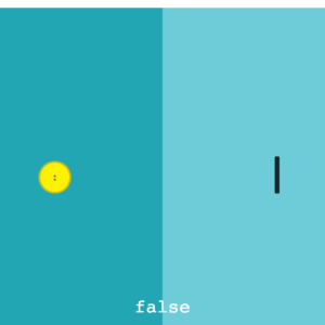
Skeuomorphism taken to the extreme rarely works. But it can be fun. Like a turntable interface for playing YouTube music or a rotary telephone dial for number inputs. For buttons, skeuomorphic design usually takes form … Read more
Skeuomorphism taken to the extreme rarely works. But it can be fun. Like a turntable interface for playing YouTube music or a rotary telephone dial for number inputs. For buttons, skeuomorphic design usually takes form … Read more
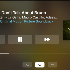
Can you play videos natively through CarPlay? That is, without jailbreaking your phone or buying expensive hardware. The short answer is, no. The longer answer is, poorly. Poorly as in, slice up a video’s audio … Read more
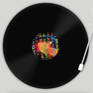
My latest experiment is Needledrop, a turntable interface for playing music from YouTube. Enjoy chill vibes as you spin a virtual vinyl of your favorite album from YouTube. You can try it for yourself here: … Read more
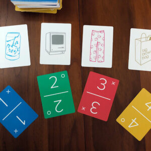
The Obsession My family gets competitive with card games. Our latest obsession is Dutch Blitz, a fast-paced game that seems somewhat regional due to the Pennsylvania Dutch influence. To give you an idea of just … Read more
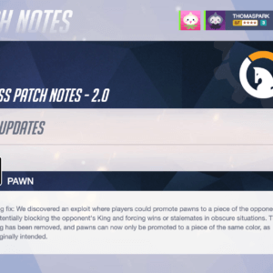
Chess is a continuously evolving game. Technically. There have been many rule changes, but each one has taken centuries to be introduced and widely adopted. That might all change though with the latest work from … Read more